Clarity as a service.
Information design
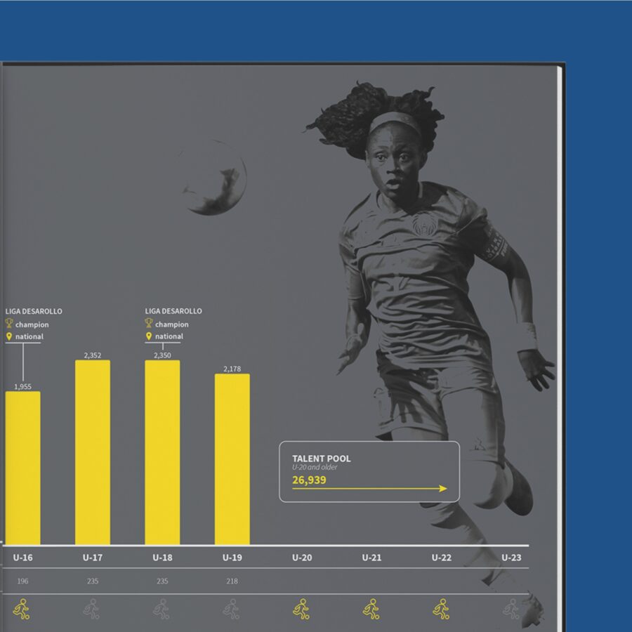
Effectively visualizing information so that your target group understands the message – that’s what gets us up in the morning!
Our approach
We work closely with you to achieve the desired result. We listen, advise, clarify, visualize and build.


The future is now
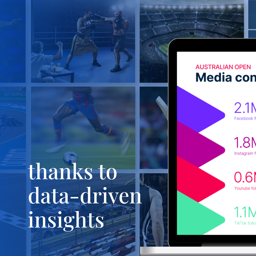
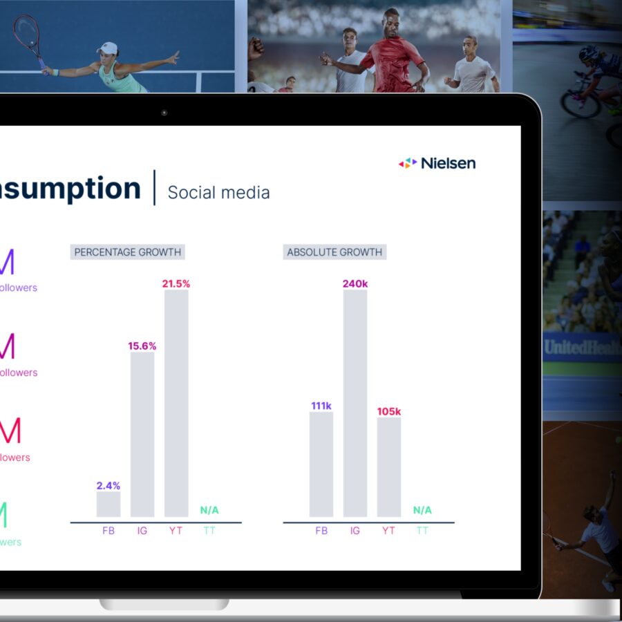
Design automation.
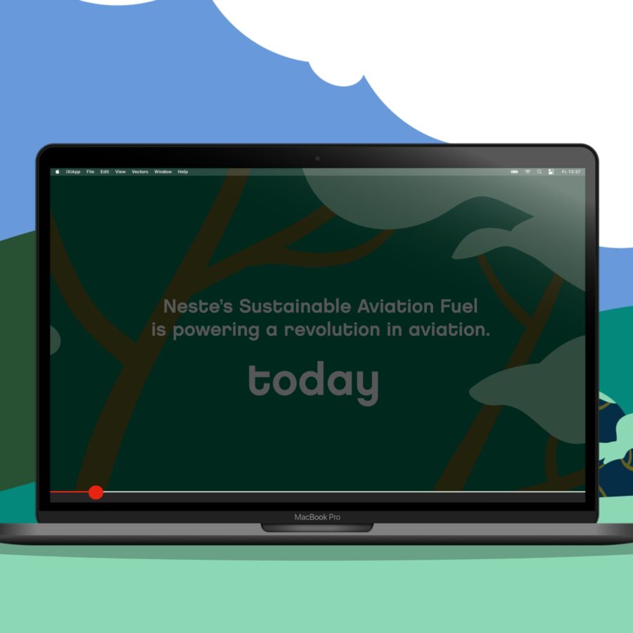
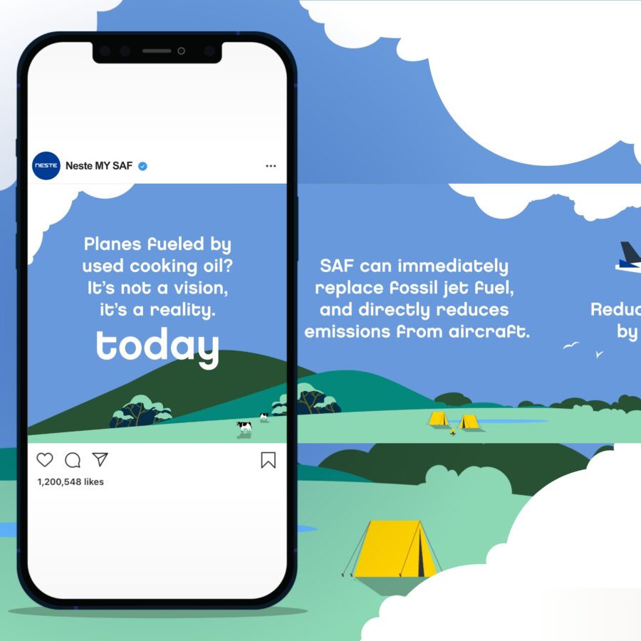
Automating design? Yes, it’s possible! Create professional reports in your own brand style with our revolutionary software. Data visualizations can be generated based on a connection with your data and much more! Save precious time and effort in report generation, without sacrificing uniqueness. Experience the power of automated report design.


Want to see more?