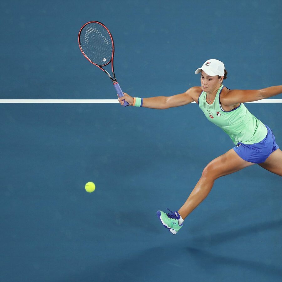
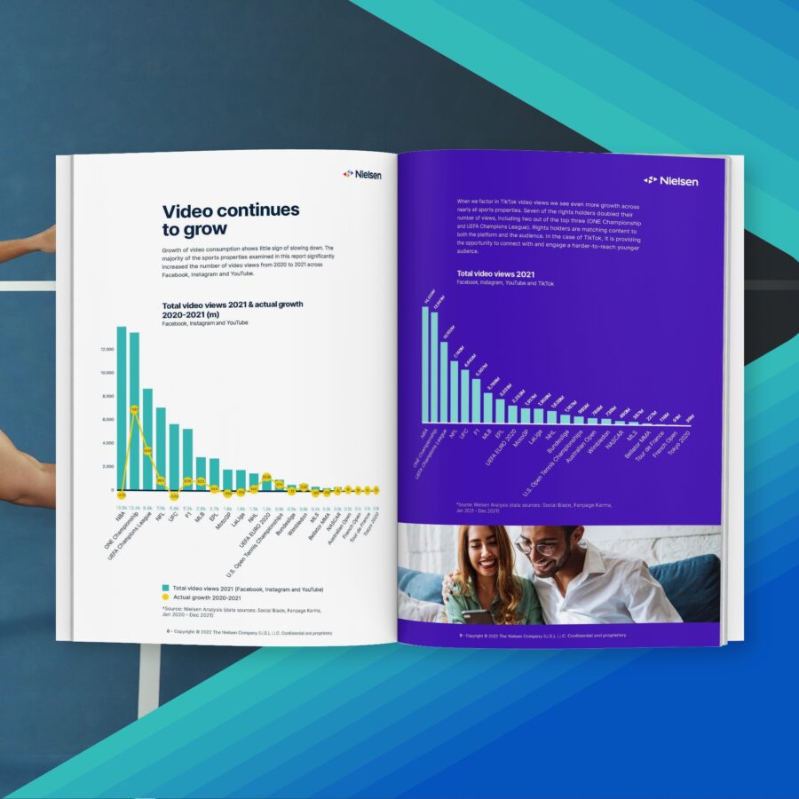
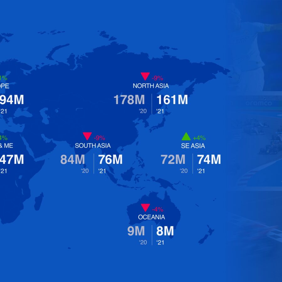
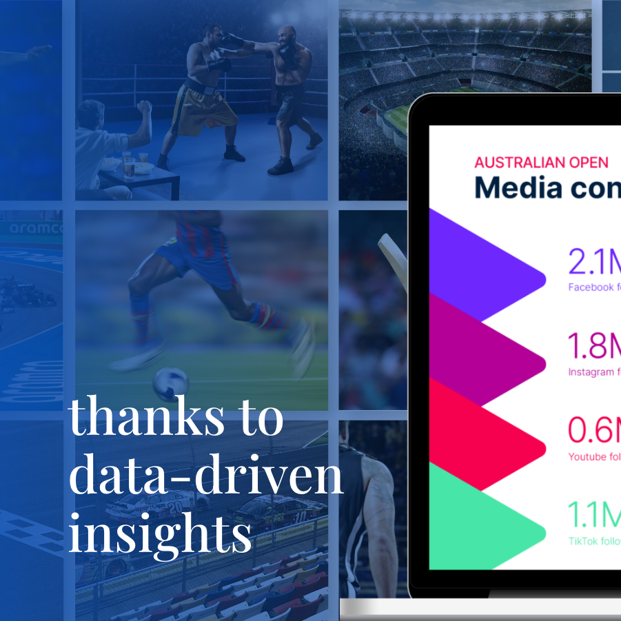
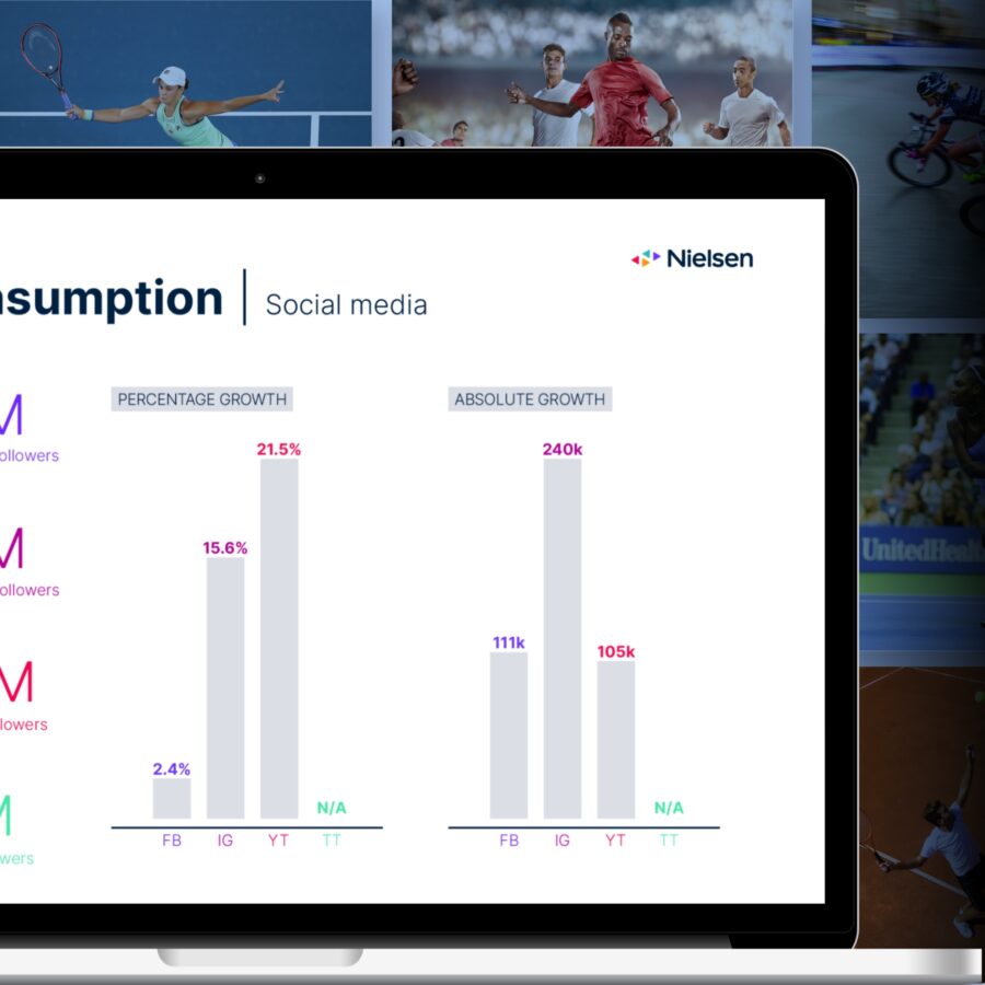
Challenge: How do you get everyone to watch a game? To make sure that fans are on the edge of their seats with excitement? How do you stay relevant as a sport, and how do you keep growing? These are questions that Nielsen can answer with their data; so Jaaf helped to make this data available for interpretation.
Solution: For the world’s 20 largest tournaments, we designed a series of 20 reports with clear data visualizations. These make it easy to discover trends and gain valuable insights. In the right context, data provides meaning.
Data visualization, Whitepaper
FIFA
From lots of data to a clear story
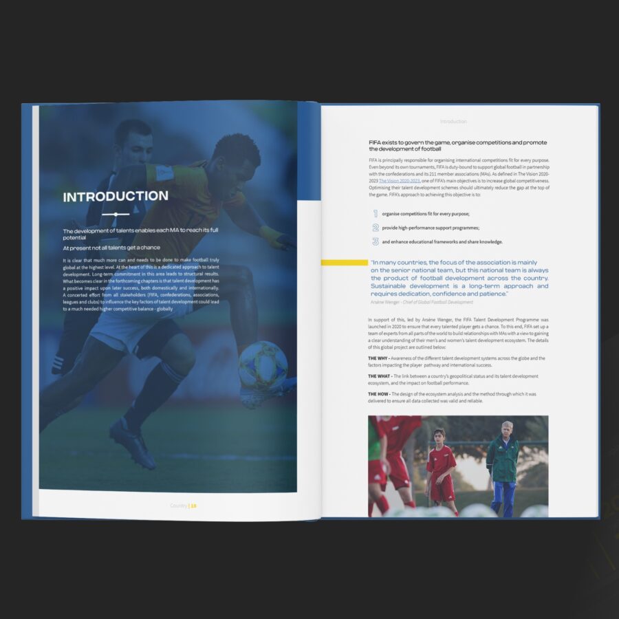
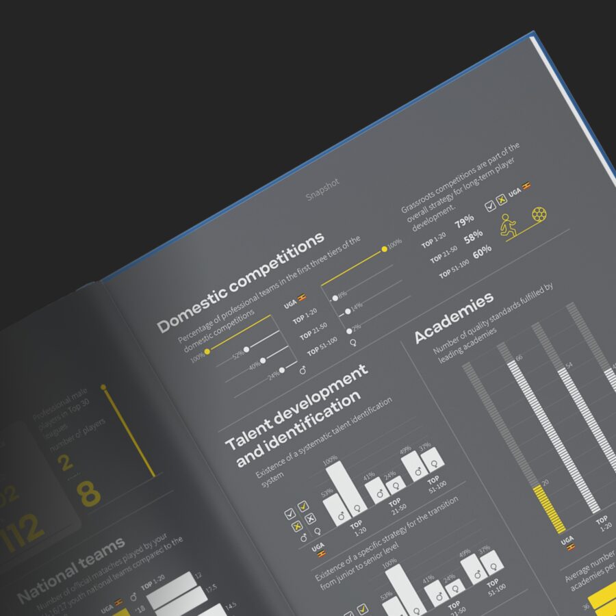
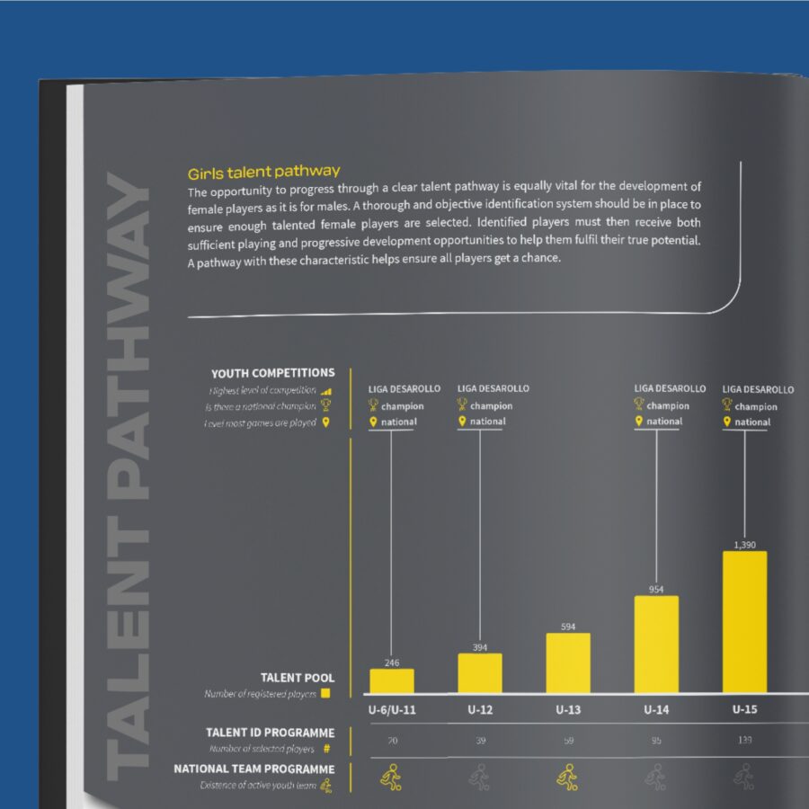
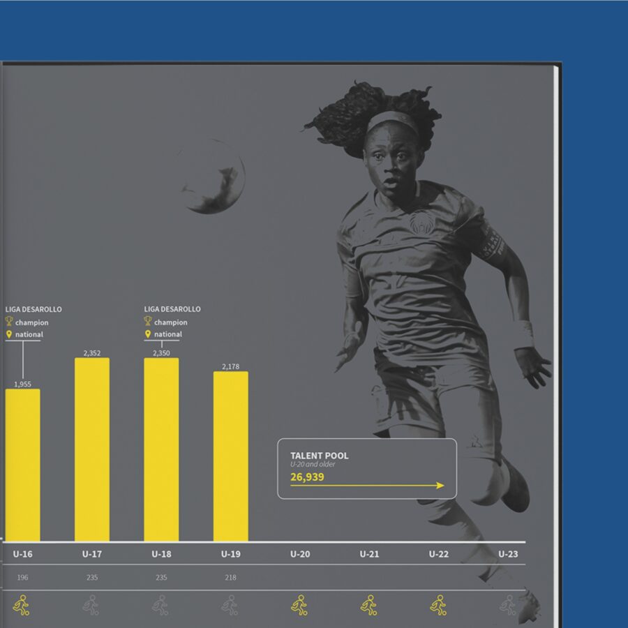
Challenge: To elevate soccer worldwide to an even higher level. To this end, FIFA investigated how soccer is structured in 200 countries. They collected more than 1,000,000 data points. Big question: how do you translate all that data into a clear and accessible story? And, not just that, but in only 200 reports!
The solution: We designed a uniquely flexible template for the report. This was applicable to all countries because we took into account the distribution of data and text. To make the process of filling out this template easier, we linked a CMS to it. At its peak, 75 people were participating at the same time!
Data visualization, report, consultancy
Neste MY SAF
Explanimating why Neste’s fuel goes the distance
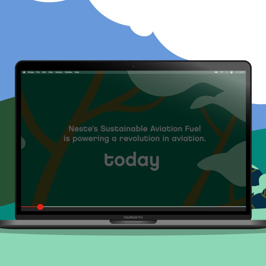
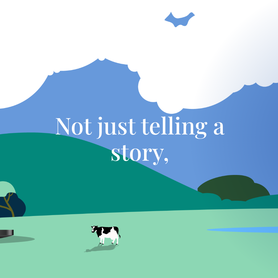
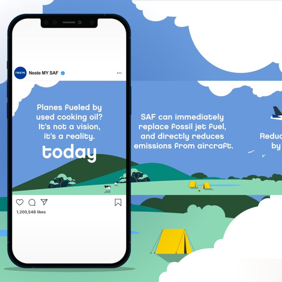
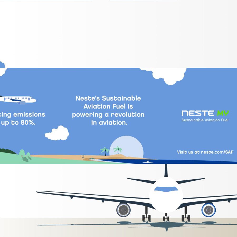
Challenge: How Neste gets from recyclable, raw materials to bio-kerosene is rather (read: extremely!) technical. At the same time, its use is very practical: taking aircraft further while bringing the sustainable future of aviation closer. Neste asked for help in explaining this story, so of course, Jaaf got on board.
The solution: We designed a set of panoramic illustrations, by way of a storyboard for their ‘explanimation’ and social media posts.
Animation, illustration, social media, storyboarding
Google
The road to online success
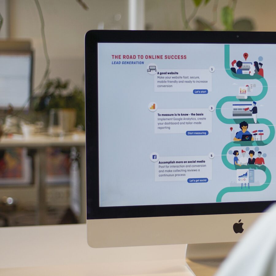
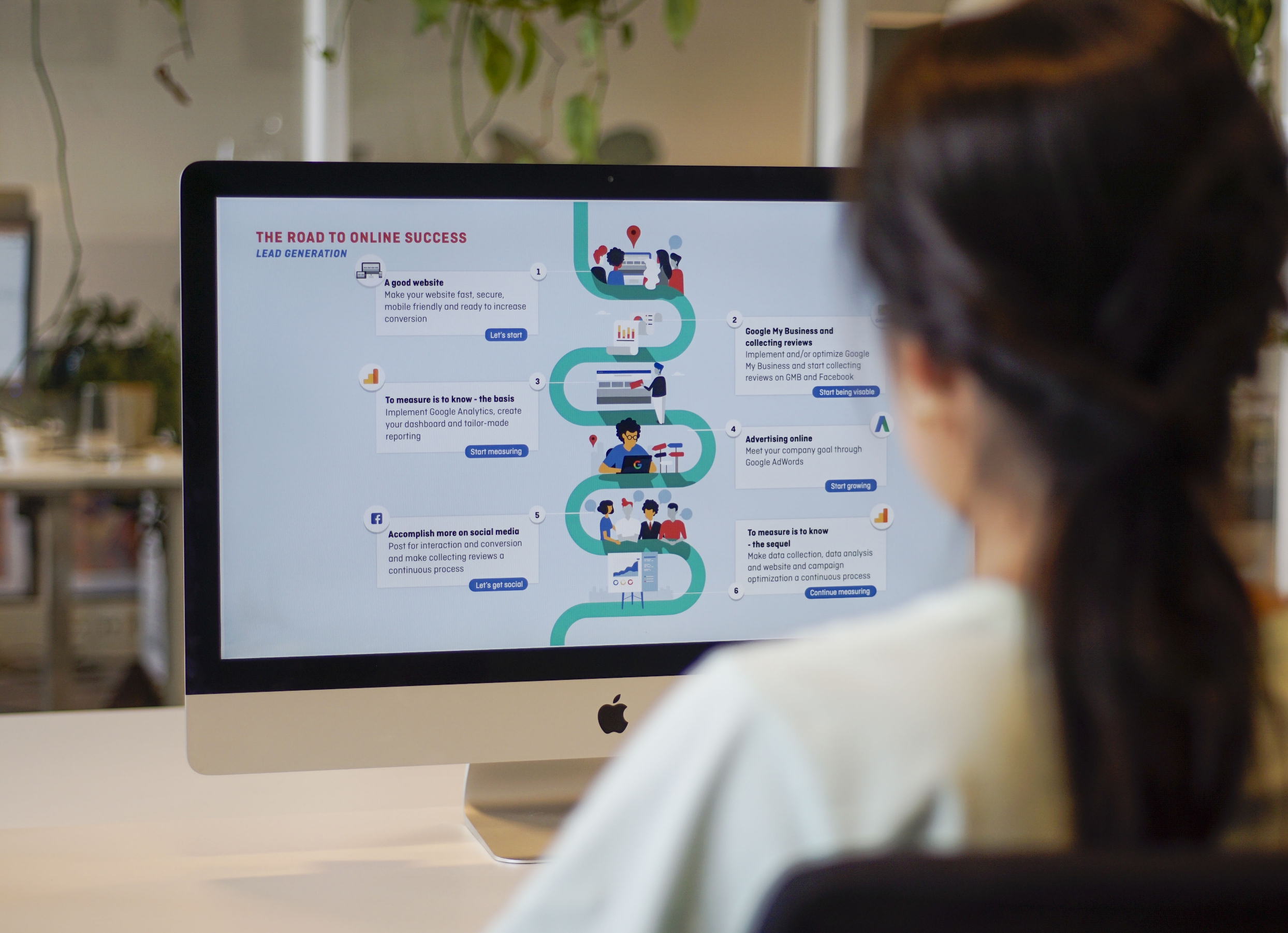
Challenge: Google My Business is a cool initiative that allows businesses to raise their profile. But how do you explain to a small or medium-sized company what it is exactly, and how they can easily use it for their business? For a one-year program Jaaf worked intensively with a select group of end-users on finding an understandable customer journey.
Solution: Jaaf developed visual instructions and clear roadmaps which were tested in weekly sessions with the end users.
Infographic, Illustration
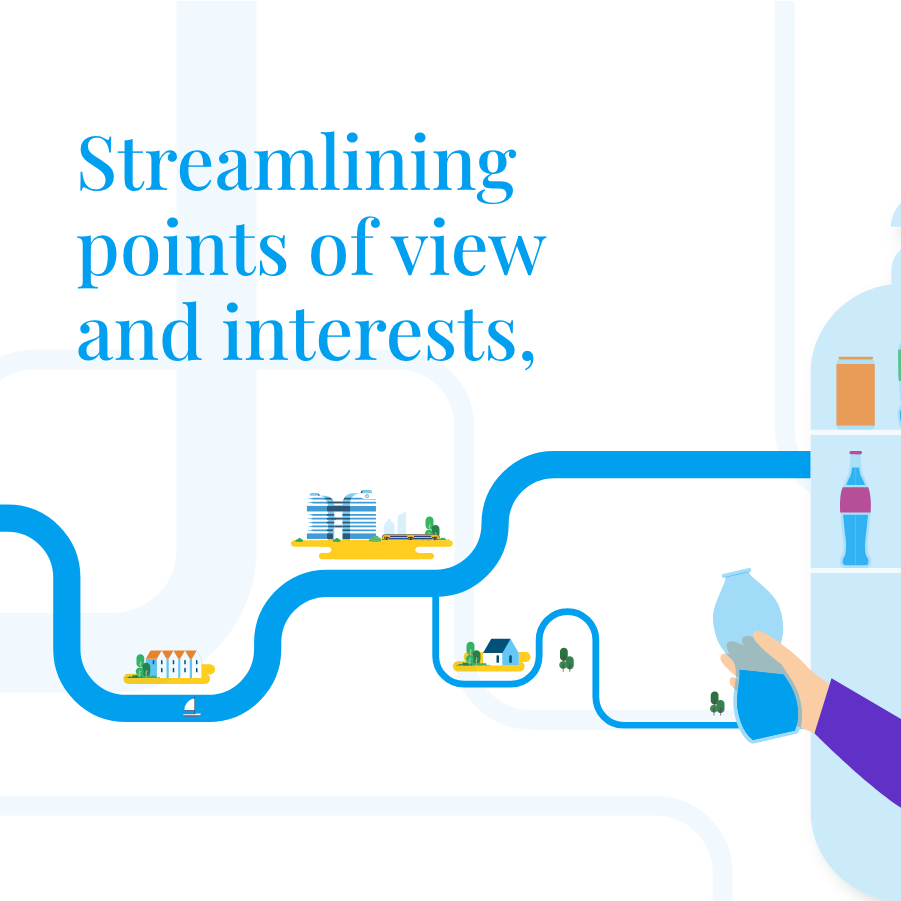
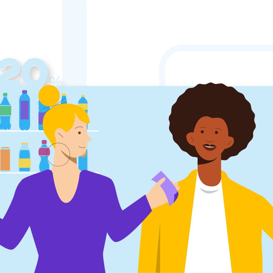
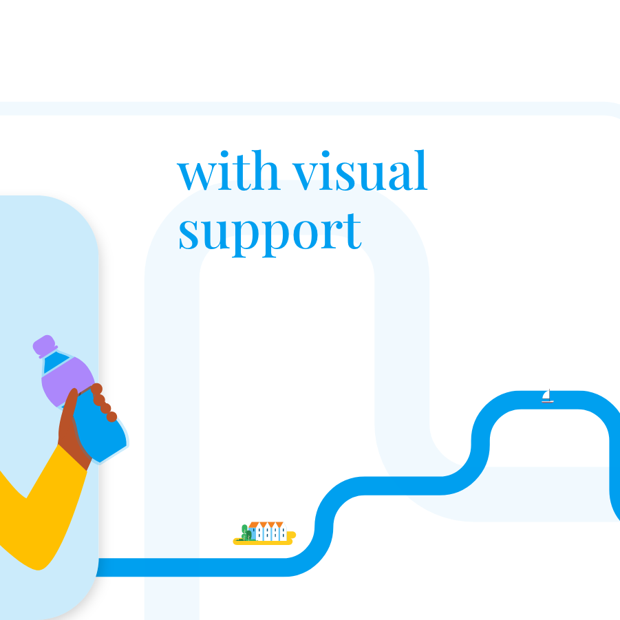
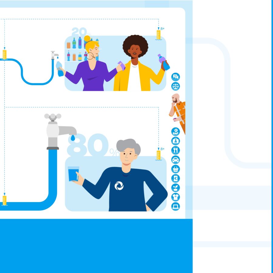
Waternet
Everybody on the same page
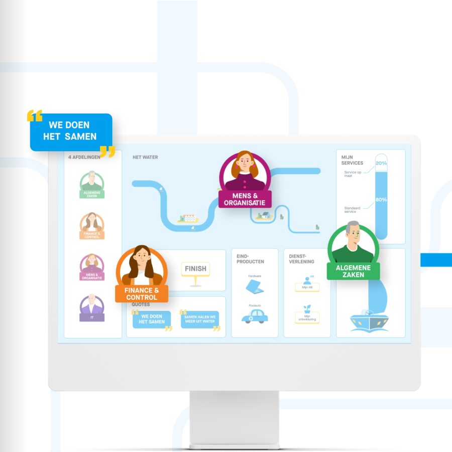
Challenge: Waternet is a large and complex organization that wanted to improve its internal services. The goal was to bring together as many services as possible in an online portal, and to provide customization where necessary. To achieve this, it was necessary to map out the various viewpoints, interests and needs within the organization. Fortunately, Jaaf was there to facilitate all internal discussions on this.
Solution: In a series of workshops, we helped the organization to clarify its direction. Through group discussions, working with a visual toolkit, we could put all ideas immediately down on paper. As a result, gradually, connections were made and the goal became clear to everyone.
Illustration, infographic, workshop
Royal HaskoningDHV
Support for innovation in water treatment
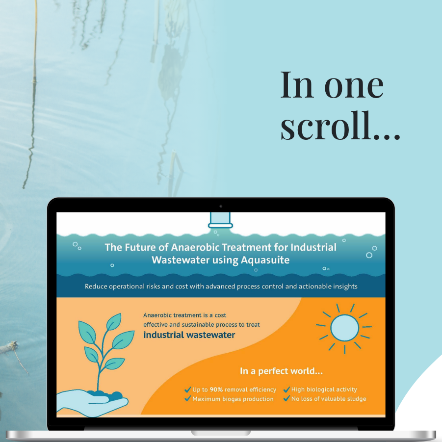
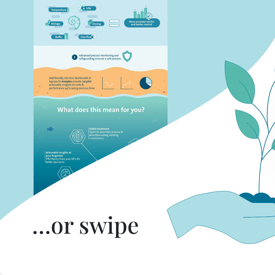
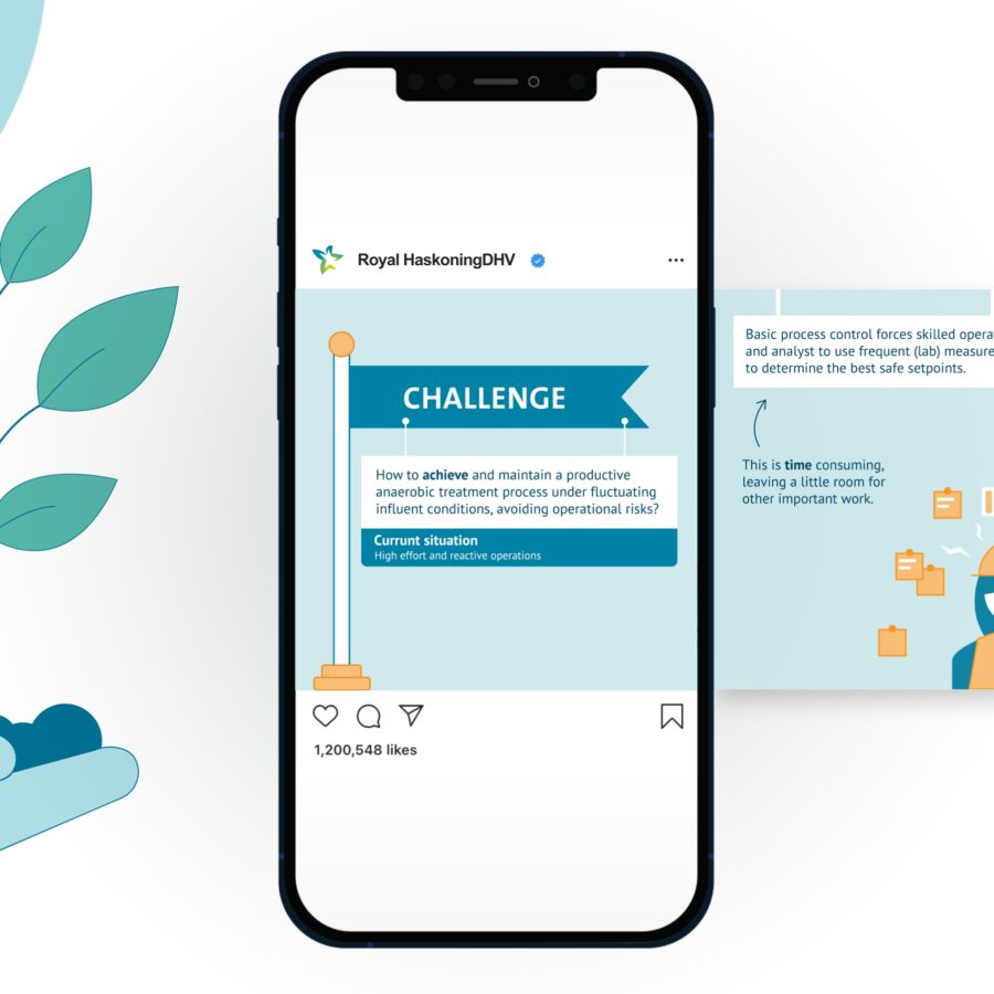
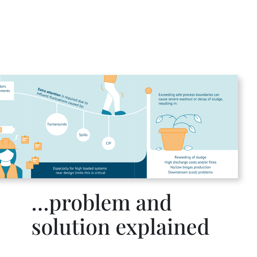
Challenge: Royal HaskoningDHV is currently researching innovative solutions for (industrial) water treatment. Major adaptations to existing water purification companies are likely, so they need to effectively communicate solid information which invites investment. Jaaf got the job done!
Solution: Through a series of infographics, we’ve shown how the process works, making the solutions more understandable. We also designed the
infographics so they can be easily broken down into smaller parts – useful for social media.
Infographic, illustration, wireframing
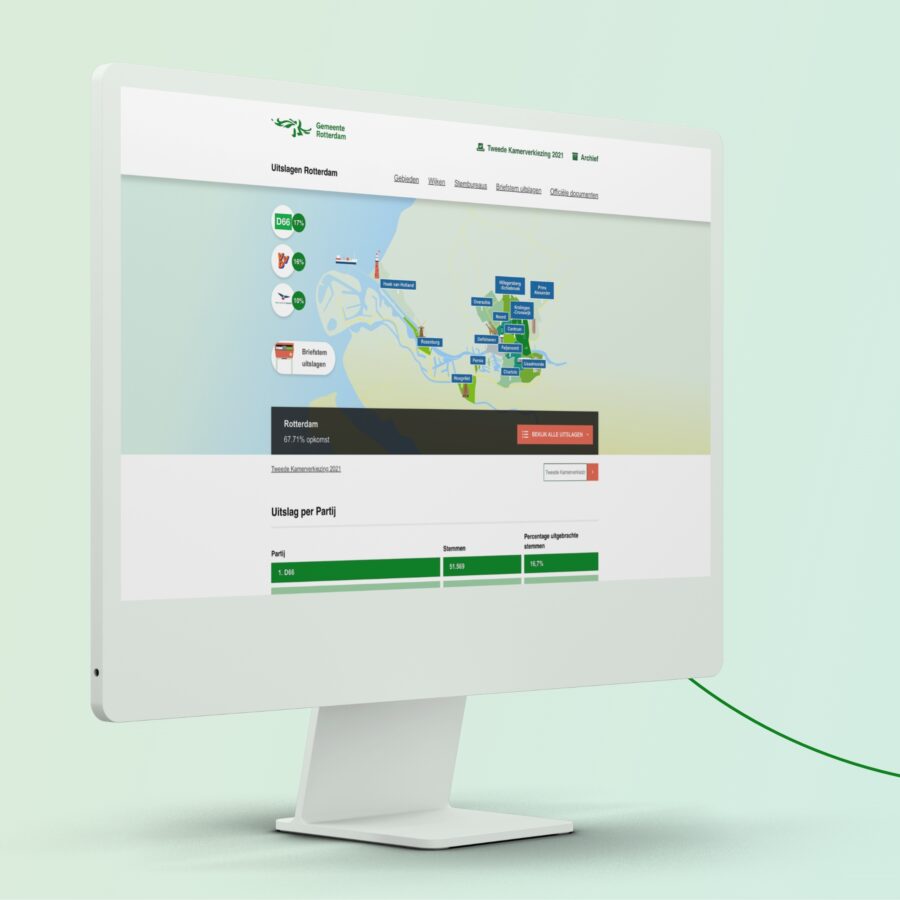
Municipality of Rotterdam
Municipality of Rotterdam
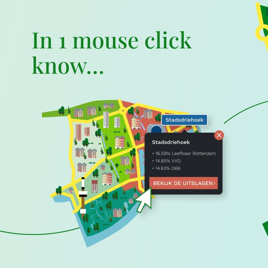
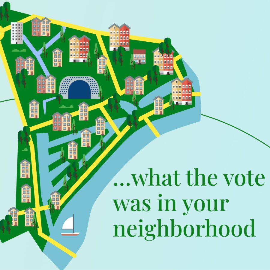
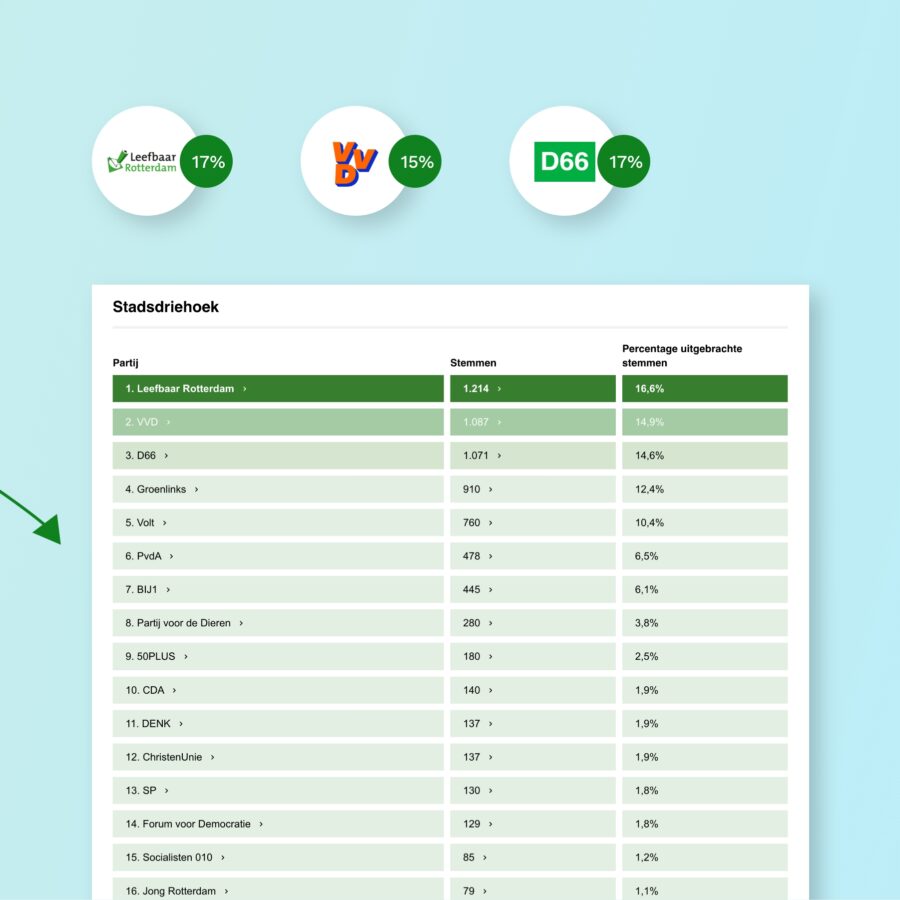
Challenge: Every municipality is required to share voting results publicly. But why publish them in boring tables when you can do it in a more attractive way? That’s precisely why the municipality of Rotterdam came to Jaaf!
Solution: Because community-minded Rotterdammers can take a great interest in their own neighborhoods, we made each local area more easily recognizable on an interactive map, through which citizens can find the results for each neighborhood, district and even polling station – accessible and attractive.
Microsite, infographic, illustration
Jane Goodall Institute
Sharing successes and plans
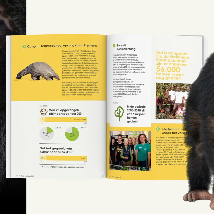
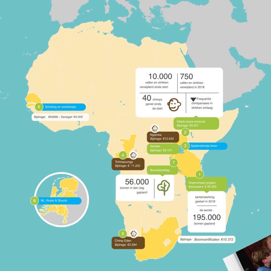
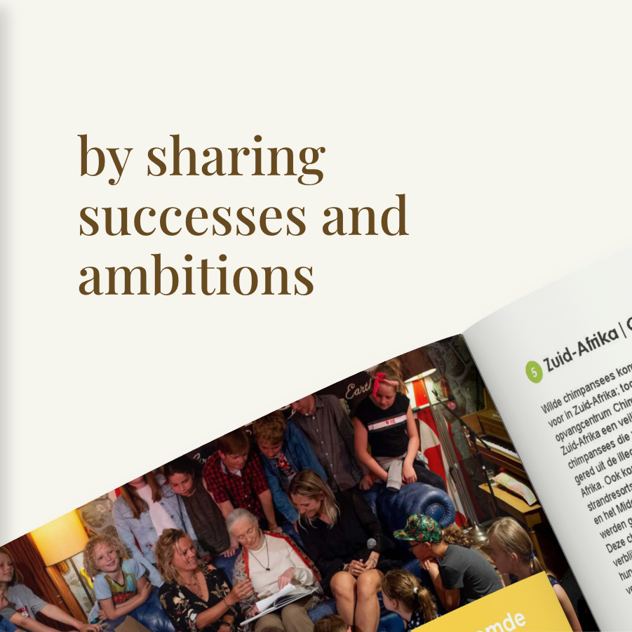
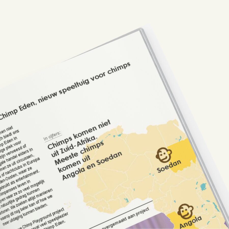
Challenge: Thanks to the support of countless volunteers and donors, the Jane Goodall Institute has successfully worked to protect chimpanzees for many years. The institute not only wanted to thank them, but also to share and be involved in their successes and future plans. To make this happen, Jaaf designed their annual report.
Solution: We used an expressive visualization of the projects to bring them to life, as well as giving context to the numbers. Now, they have a clear overview of the investments and can easily access the achieved results.
Report, data visualization, Infographic
Gezonde School
Discussing difficult topics
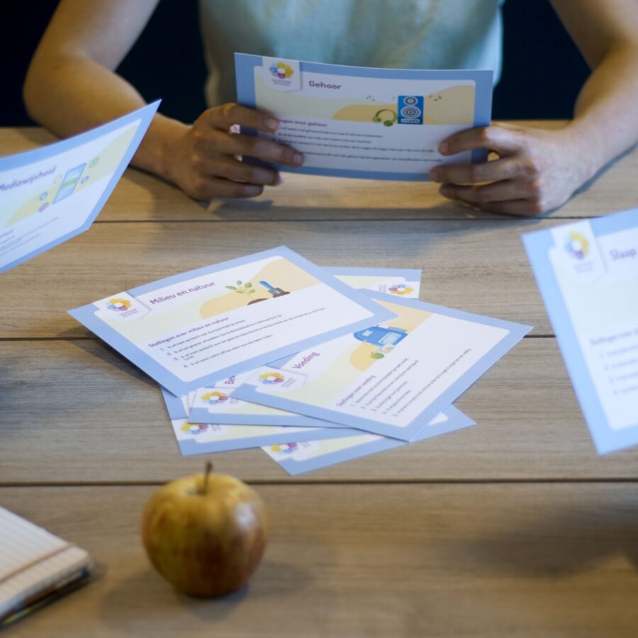
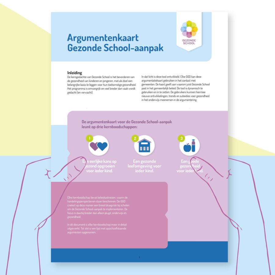
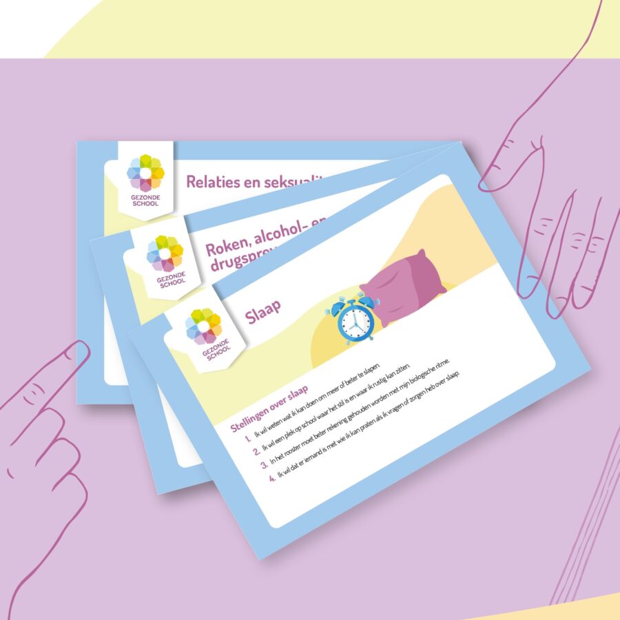
Challenge: As a teacher, how do you engage students in a discussion about relationships and sexuality? Or, about media use, smoking, as well as alcohol and drug prevention? To make these kinds of topics easier to talk about, the Healthy School developed a series of discussion cards together with Jaaf.
Solution: We designed a set of handy discussion cards with relevant statements and tips on 10 themes – both attractive to look at and, above all, practical to use!
Illustration
Hypercube Business Innovation
Predicting on the basis of data
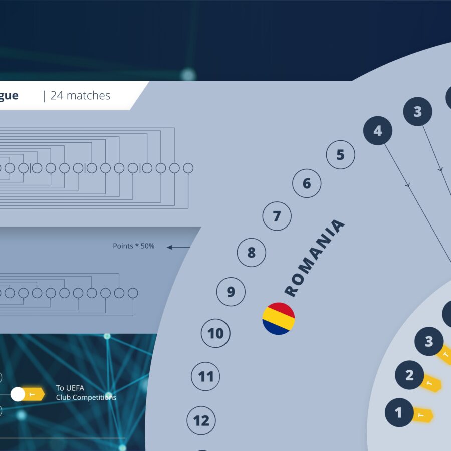
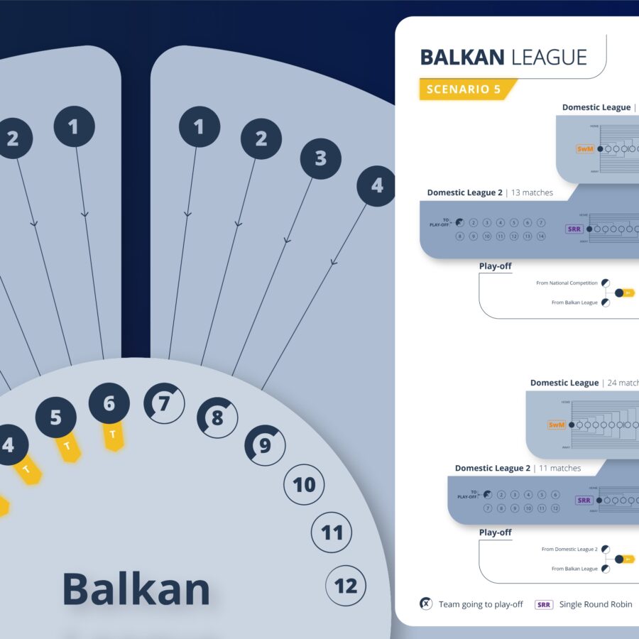
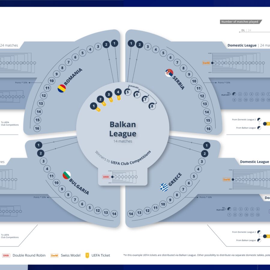
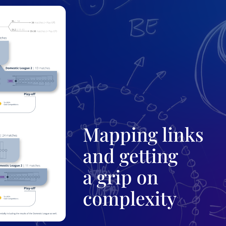
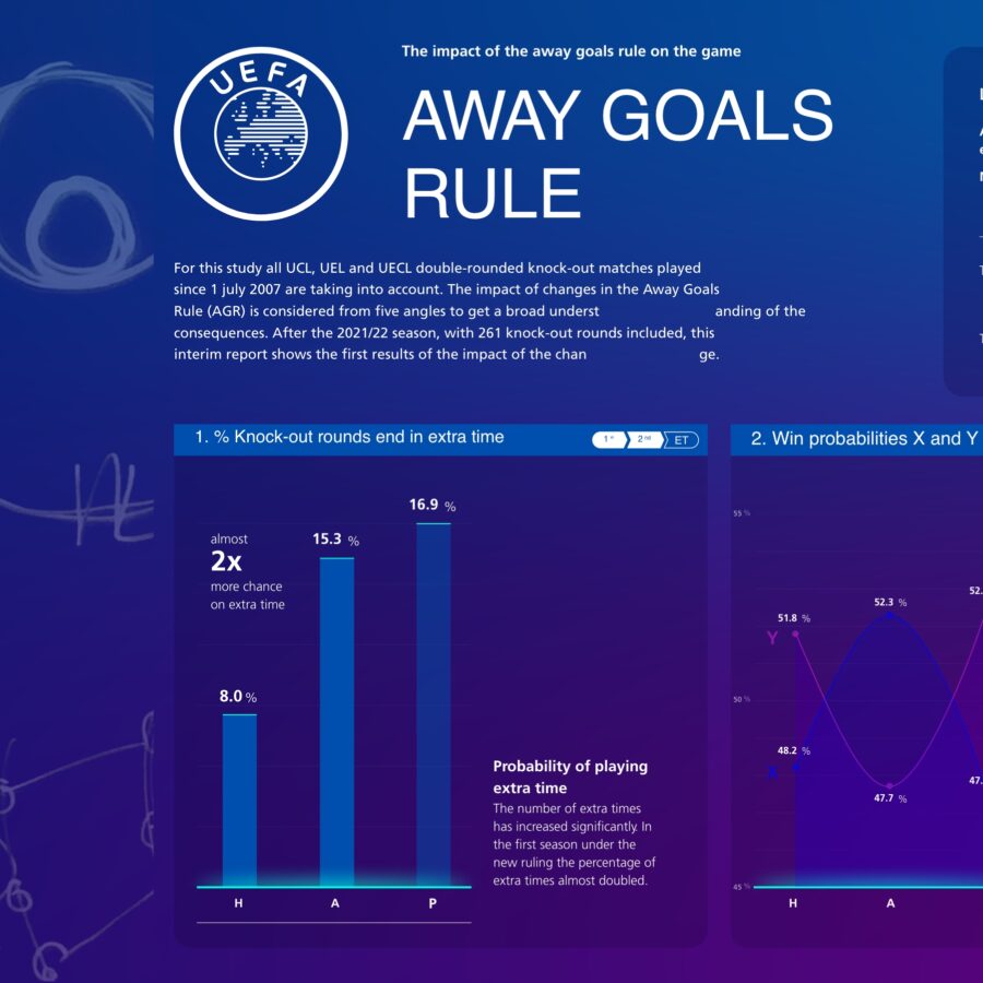
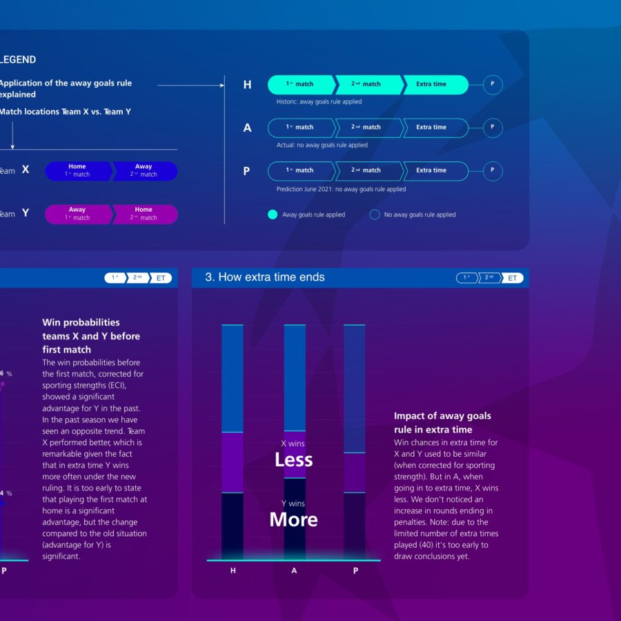
Challenge: What determines whether a sport matters or not? Moreover, how do you create exciting competition? Not only that, but how do you ensure that a game remains captivating? Hypercube answers questions like these with the use of computational models, which can predict ideal competition schedules. Jaaf again partnered up to help shape the outcomes of those models.
Solution: We visualized the individual elements using the right proportions. In so doing,, we created a picture in which each club, match and possible route to the top was given a place in the bigger picture of the league.
Data visualization, wireframes, workshop, infographic
Municipality of Amsterdam
Complexity made visual
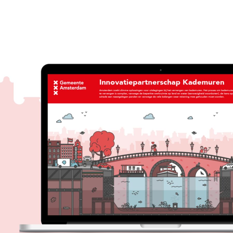
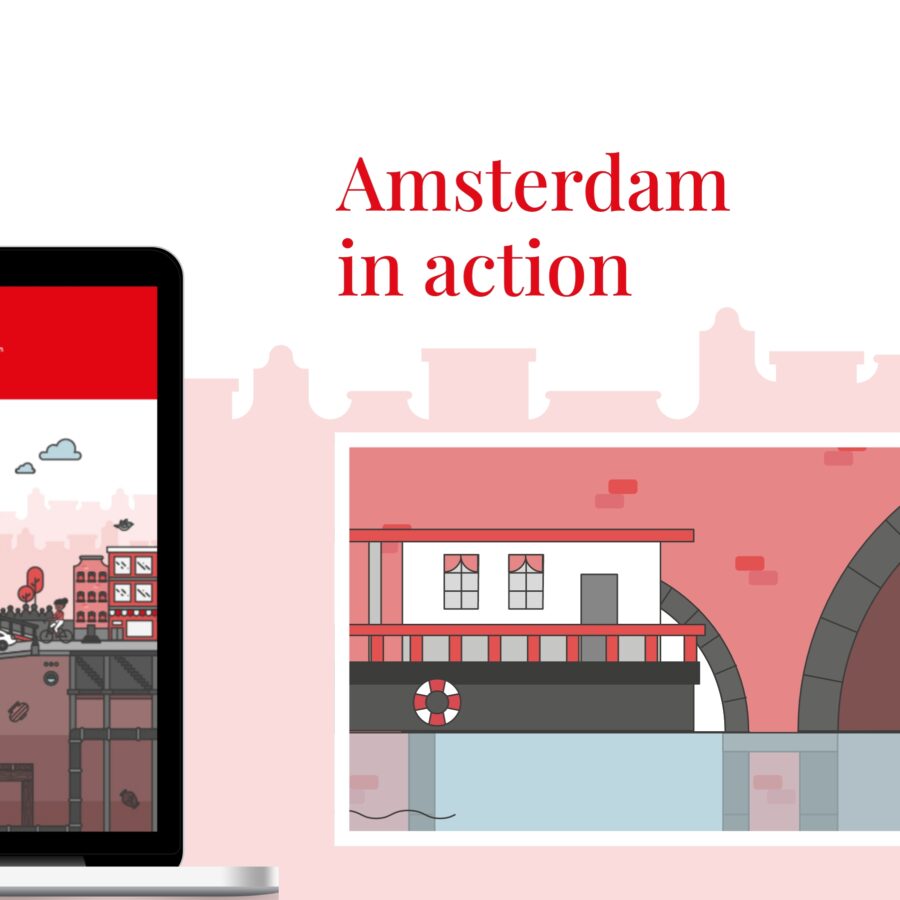
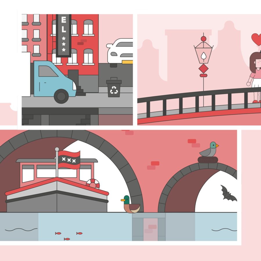
Challenge: From renovating quay walls, to creating a safe, green urban environment: the City of Amsterdam needs the commitment and support of all its residents. The municipality develops plans and policies to ensure that Amsterdam is, and remains, a great place to live, do business and visit. In another local collaboration, Jaaf has been able to make its own contribution.
Solution: In partnership with the City of Amsterdam, we designed a series of infographics which map out the complexity of topical issues and explain any associated policies, giving better insight to all involved.
Infographic, illustration
Municipality of Amsterdam
Complexity made visual
Challenge: From renovating quay walls, to creating a safe, green urban environment: the City of Amsterdam needs the commitment and support of all its residents. The municipality develops plans and policies to ensure that Amsterdam is, and remains, a great place to live, do business and visit. In another local collaboration, Jaaf has been able to make its own contribution.
Solution: In partnership with the City of Amsterdam, we designed a series of infographics which map out the complexity of topical issues and explain any associated policies, giving better insight to all involved.